| [ << ] | [ >> ] | [Top] | [Contents] | [Index] | [ ? ] |
A very important set of object classes are those for buttons. Buttons are placed on the form such that the user can push them with the mouse. The different button classes mostly are distinguished by the way they are displayed. Differences in behaviour can be achieved by using different types for a button: there exist button types that make them return to their normal state when the user releases the mouse, types for buttons that stay pushed until the user pushes them again, a radio button type for buttons that are grouped with other radio buttons and of which only one can be in the on state at a time and a touch button type for buttons that "fire" repeatedly while being pressed.
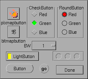
Also different shapes of buttons exist. Normal buttons are rectangles that come out of the background. When the user pushes them they go into the background (and possibly change color). Lightbuttons have a small light inside them. Pushing these buttons switches the light on. Round buttons are simple circles and, when pushed, a colored circle appears inside of them. Bitmap and pixmap buttons are buttons with an image in addition to a text label.
| 16.1 Adding Button Objects | ||
| 16.2 Button Types | ||
| 16.3 Button Interaction | ||
| 16.4 Other Button Routines | ||
| 16.5 Button Attributes | ||
| 16.6 Remarks |
Adding an object To add buttons use one of the following routines:
FL_OBJECT *fl_add_button(int type, FL_Coord x, FL_Coord y,
                         FL_Coord w, FL_Coord h,
                         const char *label);
FL_OBJECT *fl_add_lightbutton(int type, FL_Coord x, FL_Coord y,
                              FL_Coord w, FL_Coord h,
                              const char *label);
FL_OBJECT *fl_add_roundbutton(int type, FL_Coord x, FL_Coord y,
                              FL_Coord w, FL_Coord h,
                              const char *label);
FL_OBJECT *fl_add_round3dbutton(int type, FL_Coord x, FL_Coord y,
                                FL_Coord w, FL_Coord h,
                                const char *label);
FL_OBJECT *fl_add_checkbutton(int type, FL_Coord x, FL_Coord y,
                              FL_Coord w, FL_Coord h,
                              const char *label);
FL_OBJECT *fl_add_bitmapbutton(int type, FL_Coord x, FL_Coord y,
                               FL_Coord w, FL_Coord h,
                               const char *label);
FL_OBJECT *fl_add_pixmapbutton(int type, FL_Coord x, FL_Coord y,
                               FL_Coord w, FL_Coord h,
                               const char *label);
FL_OBJECT *fl_add_labelbutton(int type, FL_Coord x, FL_Coord y,
                              FL_Coord w, FL_Coord h,
                              const char *label);
FL_OBJECT *fl_add_scrollbutton(int type, FL_Coord x, FL_Coord y,
                               FL_Coord w, FL_Coord h,
                               const char *label);
|
These finctions create buttons of the following classes:
FL_BUTTONA standard normal button.
FL_LIGHTBUTTONA button with a small embedded, colored area that changes color when the button is in the on state.
FL_ROUNDBUTTONA circular button (with a label beside). The inner area of the circle changes color when the button is on. Often used for radio buttons.
FL_ROUND3DBUTTONJust like the FL_ROUNDBUTTON but the circle is dran in
a 3D-fashion.
FL_CHECKBUTTONButton shaped in the form of a rhombus slightly raised above the forms plane when off and slightly embossed (ypically with a different color) when on.
FL_BITMAPBUTTONButton decorated with a bitmap (often read in from an X bitmap file
with extension xbm) in additional to a label.
FL_PIXMAPBUTTONButton decorated with a pixmap (often read in from an X pixmap file
with extension xpm) in additional to a label. An additonal
pixmap can be set for the case that the mouse hoovers over the
button.
FL_LABELBUTTONA button that does not appear to be a button, only its label is shown, can be used e.g., for hyperlinks.
FL_SCROLLBARBUTTONA button mostly used at the ends of scrollbars - instead of a label it can only contain a triangle pointing up, down, left or right.
The meaning of the parameters is as usual. The label is by default placed inside the button for button and lightbutton. For roundbutton, round3dbutton, bitmapbutton and pixmapbutton, it is placed to the right of the circle and to the bottom of the bitmap/pixmap respectively. For scrollbutton, the label must be of some pre-determined string that indicates the direction of the scroll arrow.
The following types of buttons are available:
FL_NORMAL_BUTTONReturned to fl_do_forms() (or having its callback
funtion invoked) when released.
FL_PUSH_BUTTONStays pushed until user pushes it again.
FL_MENU_BUTTONReturned when pushed, useful e.g., for opening a popup when pushed.
FL_TOUCH_BUTTONReturned at regulat intervals as long as the user pushes it.
FL_RADIO_BUTTONPush button that switches off other radio buttons.
FL_HIDDEN_BUTTONInvisible normal button.
FL_INOUT_BUTTONReturned both when pushed and when released.
FL_RETURN_BUTTONLike a normal button but also reacts to the <Return> key.
FL_HIDDEN_RET_BUTTONInvisible return button.
Except for the FL_HIDDEN_BUTTON and
FL_HIDDEN_RET_BUTTON, which are invisible, there's not
much visible indication of the button type but the function is quite
different. For each of the types the button gets pushed down when the
user presses the mouse on top of it. What actually happens when the
user does so then depends on the type of the button. An
FL_NORMAL_BUTTON, FL_TOUCH_BUTTON and
FL_INOUT_BUTTON gets released when the user releases the
mouse button. Their difference lies in the moment at which the
interaction routines return them (see below). A
FL_PUSH_BUTTON remains pushed and is only released when
the user pushes it again. A FL_RADIO_BUTTON is a push
button with the following extra property: whenever the user pushes a
radio button, all other pushed radio buttons in the same form (or in
the same group) are released. In this way the user can make its choice
among several possibilities. A FL_RETURN_BUTTON behaves
like a normal button, but it also reacts when the <Return> key
on the keyboard is pressed. When a form contains such a button (of
course there can only be one) the <Return> key can no longer be
used to move between input fields. For this the <Tab> key must
be used.
A FL_HIDDEN_BUTTON behaves like a normal button but is
invisible. A FL_HIDDEN_RET_BUTTON is like a hidden button
but also reacts to <Return> key presses.
FL_NORMAL_BUTTONs, FL_PUSH_BUTTONs,
FL_RADIO_BUTTONs, FL_RETURN_BUTTONs and
FL_HIDDEN_BUTTONs are returned at the moment the user
releases the mouse after having pressed it on the button. A
FL_MENU_BUTTON, in contrast, is returned already on a
mouse press. A FL_INOUT_BUTTON is returned both when the
user presses it and when the user releases it. A
FL_TOUCH_BUTTON is returned all the time as long as the
user keeps the mouse button pressed while the mouse is on top of it. A
FL_RETURN_BUTTON and a FL_HIDDEN_RET_BUTTON
are also returned when the user presses the <Return> key.
As for other "active" objects, you can control under which conditions a button object gets returned or its callback invoked by using the function
int fl_set_object_return(FL_OBJECT *obj, unsigned int when); |
where reasonable values for when are
FL_RETURN_NONENever return object or invoke callback.
FL_RETURN_END_CHANGEDReturn object or invoke callback when mouse button is released and at the same moment the state of the button changed.
FL_RETURN_CHANGEDReturn object or invoke callback whenever the state of the button changes.
FL_RETURN_ENDReturn object or invoke callback when mouse button is released
FL_RETURN_ALWAYSReturn object or invoke callback on all of the above condtions.
Most buttons will always return FL_RETURN_END and
FL_RETURN_CHANGED at the same time. Exceptions are
FL_INOUT_BUTTONs and FL_TOUCH_BUTTONs. The
former returns FL_RETURN_CHANGED when pushed and both
FL_RETURN_END and FL_RETURN_CHANGED together
when released. FL_TOUCH_BUTTONs return when pressed, then
FL_RETURN_CHANGED at regular time intervals while being
pressed and finally FL_RETURN_END when released.
See demo `butttypes.c' for a feel of the different button types.
The application program can also set a button to be pushed or not itself without a user action. To this end use the routine
void fl_set_button(FL_OBJECT *obj, int pushed); |
pushed indicates whether the button should be set to be pushed
(1) or released (0). When setting a FL_RADIO_BUTTON to be
pushed this automatically releases the currently pushed radio button
in the same form (or group). Also note that this routine only
simulates the visual appearance but does not affect the program flow
in any way, i.e., setting a button as being pushed does not invoke
its callback or results in the button becoming returned to the
program. For that follow up the call of fl_set_button()
with a call of fl_trigger_object() (or
fl_call_object_callback()).
To figure out whether a button is pushed or not use(12)
int fl_get_button(FL_OBJECT *obj); |
Sometimes you want to give the button a different meaning depending on which mouse button gets pressed on it. To find out which mouse button was used at the last push (or release) use the routine
int fl_get_button_numb(FL_OBJECT *obj); |
It returns one of the constants FL_LEFT_MOUSE,
FL_MIDDLE_MOUSE, FL_RIGHT_MOUSE,
FL_SCROLLUP_MOUSE or FL_SCROLLDOWN_MOUSE
(the latter two are from the scroll wheel of the mouse). If the last
push was triggered by a shortcut (see below), the function returns the
keysym (ASCII value if the key used is between 0 and 127)
of the key plus
FL_SHORTCUT. For example, if a button has <Ctrl>-C
as its shortcut the button number returned upon activation of the
shortcut will be FL_SHORTCUT + 3 (the ASCII value of
<Ctrl>-C is 3).
It can also be controlled which mouse buttons a buttons reacts to (per default a button reacts to all mouse buttons, including the scroll wheel). To set which mouse buttons the button reacts to use
void fl_set_button_mouse_buttons(FL_OBJECT *obj, int mbuttons); |
mbuttons is the bitwise OR of the numbers 1 for the left
mouse button, 2 for the middle, 4 for the right mouse button, 8 for
moving the scroll wheel up "button" and 16 for scrolling down
"button". Per default a button reacts to all mouse buttons.
To determine which mouse buttons a button is reacting to use
void fl_get_button_mouse_buttons(FL_OBJECT *obj,
                                 unsigned int *mbuttons);
|
The value returned via mbuttons is the same value as would
be used in fl_set_button_mouse_buttons().
In a number of situations it is useful to define a keyboard equivalent
for a button. You might e.g., want to define that <Ctrl>Q has
the same meaning as pressing the "Quit" button. This can be achieved
using the following call:
void fl_set_button_shortcut(FL_OBJECT *obj, const char *str,
                            int showUL);
|
Note that str is a string, not a single character. This string
is a list of all the characters to become keyboard shortcuts for the
button. E.g., if you use string "^QQq" the button will react on the
keys q, Q and <Ctrl>Q. (As you see you can use
the symbol ^ to indicate the control key. Similarly you can use
the symbol # to indicate the <Alt> key.) Be careful with
your choices. When the form also contains input fields you probably
don't want to use the normal printable characters because they can no
longer be used for input in the input fields. Shortcuts are always
evaluated before input fields. Other special keys, such as <F1>
etc., can also be used as shortcuts. See section Shortcuts, for details.
Finally, keep in mind that a button of type FL_RETURN_BUTTON is
in fact nothing more than a normal button, just with the
<Return> key set as the shortcut. So don't change the shortcuts
for such a button.
If the third parameter showUL is true and one of the letters in
the object label matches the shortcut the matching letter will be
underlined. This applies to non-printable characters (such as
#A) as well in the sense that if the label contains the letter
a or A it will be underlined (i.e., special characters
such as # and ^ are ignored when matching). A false
value (0) for showUL turns off underlining without affecting
the shortcut. Note that although the entire object label is searched
for matching character to underline of the shortcut string itself only
the first (non-special) character is considered, thus a shortcut
string of "Yy" for the label "Yes" will result in the
letter Y becoming underlined while for "yY" it won't.
To set the bitmap to use for a bitmap button the following functions can be used:
void fl_set_bitmapbutton_data(FL_OBJECT *obj, int w, int h,
                              unsigned char *bits);
void fl_set_bitmapbutton_file(FL_OBJECT *obj, const char *filename);
|
Similarly, to set the pixmap to use for a pixmap button the following routines can be used:
void fl_set_pixmapbutton_data(FL_OBJECT *obj, unsigned char **bits);
void fl_set_pixmapbutton_file(FL_OBJECT *obj, const char *file);
void fl_set_pixmapbutton_pixmap(FL_OBJECT *obj, Pixmap id,
                                 Pixmap mask);
|
To use the first routine, you #include the pixmap file into
your source code and use the pixmap definition data (an array of char
pointers) directly. For the second routine the filename file
that contains the pixmap definition is used to specify the pixmap. The
last routine assumes that you already have a X Pixmap resource ID for
the pixmap you want to use. Note that these routines do not free a
pixmap already associated with the button. To free the pixmaps use
the function
void fl_free_pixmapbutton_pixmap(FL_OBJECT *obj); |
This function frees the pixmap and mask together with all the colors allocated for them.
To get the pixmap and mask that is currently being displayed, use the following routine
Pixmap fl_get_pixmapbutton_pixmap(FL_OBJECT *obj,
                                  Pixmap &pixmap, Pixmap &mask);
|
Pixmaps are by default displayed centered inside the bounding box. However, this can be changed using the following routine
void fl_set_pixmapbutton_align(FL_OBJECT *obj, int align,
                               int xmargin, int ymargin);
|
where align is the same as that used for labels. See section Label Attributes and Fonts, for a list. xmargin and ymargin
are extra margins to leave in addition to the object border width.
Note that although you can place a pixmap outside of the bounding box,
it probably is not a good idea.
When the mouse enters a pixmap button an outline of the button is shown. If required, a different pixmap (the focus pixmap) can also be shown. To set such a focus pixmap the following functions are available:
void fl_set_pixmapbutton_focus_data(FL_OBJECT *obj,
                                     unsigned char **bits);
void fl_set_pixmapbutton_focus_file(FL_OBJECT *obj,
                                    const char *file);
void fl_set_pixmapbutton_focus_pixmap(FL_OBJECT *obj, Pixmap id,
                                      Pixmap mask);
|
The meanings of the parameters are the same as that in the regular pixmap routines.
Finally, there's a function that can be used to enable or disable the focus outline
void fl_set_pixmapbutton_focus_outline(FL_OBJECT *obj, int yes_no); |
See also Pixmap Object, for pixmap color and transparency handling.
To get rid of a focus pixmap of a pixmap button use the function
void fl_free_pixmap_focus_pixmap(FL_OBJECT *obj); |
For normal buttons the first color argument (col1) to
fl_set_object_color() controls the normal color and the
second (col2) the color the button has when pushed. For
lightbuttons col1 is the color of the light when off and
col2 the color when on. For round buttons, col1 is the
color of the circle and col2 the color of the circle that is
placed inside it when pushed. For round3dbutton, col1 is the
color of the inside of the circle and col2 the color of the
embedded circle. For bitmapbuttons, col1 is the normal box
color (or bitmap background if boxtype is not FL_NO_BOX) and
col2 is used to indicate the focus color. The foreground color
of the bitmap is controlled by label color (as set via
fl_set_object_lcolor(). For scrollbutton, col1 is
the overall boundbox color (if boxtype is not FL_NO_BOX),
col2 is the arrow color. The label of a scrollbutton must be a
string with a number between 1 and 9 (except 5), indicating the arrow
direction like on the numerical key pad. The label can have an
optional prefix # to indicate uniform scaling. For example, the
label "#9" tells that the arrow should be pointing up-right and
the arrow has the identical width and height regardless the overall
bounding box size.
See all demo programs, in particular `pushbutton.c' and `buttonall.c' for the use of buttons.
| [ << ] | [ >> ] | [Top] | [Contents] | [Index] | [ ? ] |
This document was generated by Jens Thoms Toerring on January 5, 2014 using texi2html 1.82.