3. Defining Forms
In this chapter we will describe the basics of defining forms. Not all
possible classes of objects are described here, only the most common
ones. Also, for most classes only a subset of the available types are
described. See Part III for a complete overview of all object classes
currently available.
Normally you will almost never have to write the code to define forms
yourself because the package includes a Form Designer that does this
for you (see Part II). Still it is useful to read through this chapter
because it explains what some of the different object classes are and
how to work with them.
3.1 Starting and Ending a Form Definition
A form consists of a collection of objects. A form definition is started
with the routine
| | FL_FORM *fl_bgn_form(int type, FL_Coord w, FL_Coord h);
|
w and h indicate the width and height of the form (in
pixels by default). Positions in the form will be indicated by
integers between 0 and w-1 or h-1. The actual size of
the form when displayed on the screen can still be varied. type
indicates the type of the background drawn in the form. The background
of each form is a box. See the next section for the different types
available. The routine returns a pointer to the form just defined.
This pointer must be used, for example, when drawing the form or doing
interaction with it. The form definition ends with
Between these two calls objects are added to the form. The following
sections describe some of the more common classes of objects that can
be added to a form.
there's no built-in upper limit on the number of forms that can be
defined and displayed when required. Normally you probably will first
define all your forms before starting the actual work but it's no
problem to define new forms also later on.
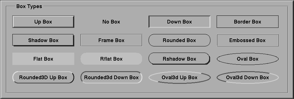
3.2 Boxes
The probably simplest type of objects are boxes. Boxes are used to
give the forms and objects a nicer appearance. They can be used to
visually group other objects together. The background of each form is
a box. To add a box to a form you use the routine
| | FL_OBJECT *fl_add_box(int type, FL_Coord x, FL_Coord y,
FL_Coord w, FL_Coord h, const char *label);
|
where type indicates the shape of the box. The Forms
Library at the moment supports the following types of boxes:
-
-
FL_NO_BOX
No box at all (it's transparent), just a label
-
FL_UP_BOX
A box that comes out of the screen
-
FL_DOWN_BOX
A box that goes down into the screen
-
FL_BORDER_BOX
A flat box with a border
-
FL_SHADOW_BOX
A flat box with a shadow
-
FL_FRAME_BOX
A flat box with an engraved frame
-
FL_ROUNDED_BOX
A rounded box
-
FL_EMBOSSED_BOX
A flat box with an embossed frame
-
FL_FLAT_BOX
A flat box without a border (normally invisible unless given a
different color than the surroundings)
-
FL_RFLAT_BOX
A rounded box without a border (normally invisible unless given a
different color than the surroundings)
-
FL_RSHADOW_BOX
A rounded box with a shadow
-
FL_OVAL_BOX
A box shaped like an ellipse
-
FL_ROUNDED3D_UPBOX
A rounded box coming out of the screen
-
FL_ROUNDED3D_DOWNBOX
A rounded box going into the screen
-
FL_OVAL3D_UPBOX
An oval box coming out of the screen
-
FL_OVAL3D_DOWNBOX
An oval box going into the screen
The arguments x and y in the call of
fl_add_box()indicate the upper left corner of the box in
the form while w and h are its width and height.
label is a text that is placed in the center of the box. If you
don't want a label in the box use an empty string or a NULL
pointer. The label can be either one line or multiple lines. To obtain
multi-line labels, insert newline characters (\n) in the label
string. It is also possible to underline the label or one of the
characters in the label. This is accomplished by embedding
<CNTRL> H (\010 or '\b') after the letter that
needs to be underlined. If the very first character of the label is
<Ctrl>H, the entire label is underlined.
The routine fl_add_box() returns a pointer to the box object.
(All routines that add objects return a pointer to the object.) This
pointer can be used for later references to the object.
It is possible to change the appearance of a box in a form. First of
all, it is possible to change the color of the box and secondly, it is
possible to change color, size and position of the label inside the
box. Details on changing attributes of objects can be found in
Changing Attributes. Just a simple example has to suffice here.
Assume we want to create a red box, coming out of the screen with the
large words "I am a Box" in green in the center:
| | FL_OBJECT *thebox;
thebox = fl_add_box(FL_UP_BOX, 20, 20, 100, 100, "I am a Box");
fl_set_object_color(thebox, FL_RED, 0 ); /* make box red */
fl_set_object_lcolor(thebox, FL_GREEN ); /* make label green */
fl_set_object_lsize(thebox, FL_LARGE_SIZE); /* make label large */
|
Of course, this has to be placed inside a form definition (but the
functions for changing the object attributes can also used anywhere
else within the program).
3.3 Texts
A second type of object is text. Text can be placed at any place on the
form in any color you like. Placing a text object is done with the
routine
| | FL_OBJECT *fl_add_text(int type, FL_Coord x, FL_Coord y,
FL_Coord w, FL_Coord h, const char *label);
|
where type indicates the shape of the text. The Forms Library at
the moment supports only one type of text: FL_NORMAL_TEXT.
The text can be placed inside a box using the routine
fl_set_object_boxtype() to be described in Changing Attributes. Again, the text can be multi-lined or underlined by
embedding respectively the newline (\n) or <Ctrl>H
(\010 or '\b') in the label. The style, size and color
of the text can be controlled and changed in many ways, see section Label Attributes and Fonts.
Note that there is almost no difference between a box with a label and
a text. The only difference lies in the position where the text is
placed object. Text is normally placed inside the box at the left
side. This helps you put different lines of text below each other.
Labels inside boxes are by default centered in the box. You can change
the position of the text inside the box using the routines in
Label Attributes and Fonts. Note that, when not using any box
around the text there is no need to specify a width and height of the
box, they can both be 0.
3.4 Buttons
A very important class of objects are buttons. Buttons are placed on the
form such that the user can push them with the mouse. Different types of
buttons exist: buttons that return to their normal position when the
user releases the mouse, buttons that stay pushed until the user pushes
them again and radio buttons that make other buttons be released. Adding
a button to a form can be done using the following routine
| | FL_OBJECT *fl_add_button(int type, FL_Coord x, FL_Coord y,
FL_Coord w, FL_Coord h,
const char *label);
|
label is the text placed inside (or next to) the button.
type indicates the type of the button. The Forms Library at the
moment supports a number of types of buttons. The most important ones
are:
| | FL_NORMAL_BUTTON
FL_PUSH_BUTTON
FL_TOUCH_BUTTON
FL_RADIO_BUTTON
|
They all look the same on the screen but their functions are quite
different. Each of these buttons get pushed down when the user presses
the mouse on top of them. What actually happens when the user does so
depends on the type of button.
A normal button returns to its normal position when the user releases
the mouse button.
A push button remains pushed and is only released when the user pushes
it again.
A touch button is like a normal button except that as long as the user
keeps the mouse pressed it is returned to the application program
(see section Doing Interaction on the details
of interaction).
A radio button is a push button with additional extra property:
Whenever the user pushes a radio button, all other pushed radio
buttons in the form (or at least in the group, see below) they belong
to are released. In this way the user can make a choice among some
mutually exclusive possibilities.
Whenever the user pushes a button and then releases the mouse, the
interaction routine fl_do_forms() is interrupted and
returns a pointer to the button that was pushed and released. If a
callback routine is present for the object being pushed, this routine
will be invoked. In either case, the application program knows that
the button was pushed and can take action accordingly. In the first
case, control will have to be returned to fl_do_forms()
again after the appropriate action is performed; and in the latter,
fl_do_forms() would never return. See section Doing Interaction, for details on the interaction with
forms.
Different types of buttons are used in all the example programs
provided. The application program can also set a button to appear
pushed or not without user action. This is of course only useful
for push buttons and radio buttons. To set or reset a push or radio
button use the routine
| | void fl_set_button(FL_OBJECT *obj, int pushed);
|
pushed indicates whether the button should appear to be pushed
(1) or released (0). Note that this does not invoke a callback routine
bound to the button or results in the button getting returned to the
program, i.e., only the visual appearance of the button is changed
and what it returns when asked for its state (and, in the case of a
radio button, possibly that of another radio button in the same
group). To also get the callback invoked or the button returned to the
program additonally call e.g., fl_trigger_object().
To figure out whether a button appears as pushed or not use
| | int fl_get_button(FL_OBJECT *obj);
|
See the program `pushbutton.c' for an example of the
use of push buttons and setting and getting button information.
The color and label of buttons can again be changed using the routines
in Changing Attributes.
There are other classes of buttons available that behave the same way as
buttons but only look different.
- Light buttons
have a small "light" (colored area) in the button. Pushing the button
switches the light on, and releasing the button switches it off. To
add a light button use fl_add_lightbutton() with the same
parameters as for normal buttons. The other routines are exactly the
same as for normal buttons. The color of the light can be controlled
with the routine fl_set_object_color(), see section Changing Attributes.
- Round buttons
are buttons that are round. Use fl_add_roundbutton() to
add a round button to a form.
- Round3d buttons
are buttons that are round and 3D-ish looking. Round and light buttons
are nice as radio and push buttons.
- Check buttons
are buttons that have a small checkbox the user can push. To add a
check button, use fl_add_checkbutton(). More stylish for
a group of radio buttons.
- Bitmap buttons
are buttons that have a bitmap on top of the box. Use routine
fl_add_bitmapbutton() to add a bitmap button to a form.
- Pixmap buttons
are buttons that have a pixmap on top of the box. Use routine
fl_add_pixmapbutton() to add a pixmap button to a form.
Playing with different boxtypes, colors, etc., you can make many
different types of buttons. See `buttonall.c' for some examples.
Fig. 16.1 shows all buttons in their default states.
3.5 Sliders
Sliders are useful in letting the user indicate a value between some
fixed bounds. A slider is added to a form using the routine
| | FL_OBJECT *fl_add_slider(int type, FL_Coord x, FL_Coord y,
FL_Coord w, FL_Coord h,
const char *label);
|
The two most important types of sliders are FL_VERT_SLIDERM and
FL_HOR_SLIDER. The former displays a slider that can be moved
vertically and the latter gives a slider that moves horizontally. In
both cases the label is placed below the slider. Default value of the
slider is 0.5 and can vary between 0.0 and 1.0. These values can be
changed using the routines:
| | void fl_set_slider_value(FL_OBJECT *obj, double val);
void fl_set_slider_bounds(FL_OBJECT *obj, double min, double max);
|
Whenever the value of the slider is changed by the
user, it results in the slider being returned to the application program
or the callback routine invoked. The program can read the slider value
using the call
| | double fl_get_slider_value(FL_OBJECT *obj);
|
and take action accordingly. See the example program `demo05.c' for
the use of these routines.
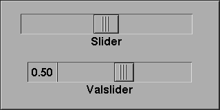
3.6 ValSliders
A valslider is almost identical with a normal slider. The only
difference is the way the slider is drawn. For valsliders, in addition
to the slider itself, its current value is also shown.
To add a valslider, use
| | FL_OBJECT *fl_add_valslider(int type, FL_Coord x, FL_Coord y,
FL_Coord w, FL_Coord h,
const char *label);
|
For all other interaction with a valslider the same function as for
normal sliders can be used.
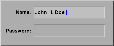
3.7 Input Fields
It is often required to obtain textual input from the user, e.g., a file
name, some fields in a database, etc. To this end input fields exist in
the Forms Library. An input field is a field that can be edited by the
user using the keyboard. To add an input field to a form use
| | FL_OBJECT *fl_add_input(int type, FL_Coord x, FL_Coord y,
FL_Coord w, FL_Coord h, const char *label);
|
The main type of input field available is FL_NORMAL_INPUT. The
input field normally looks like an FL_DOWN_BOX. This can be
changed using the routine fl_set_object_boxtype() to be
described in Changing Attributes.
Whenever the user presses the mouse inside an input field a cursor will
appear in it (and it will change color). Further input will appear
inside this field. Full emacs(1) style editing is supported. When the
user presses <Return> or <Tab> the input field is returned
to the application program and further input is directed to the next
input field. (The <Return> key only works if there are no default
buttons in the form. See the overview of object classes. The
<Tab> key always works.)
The user can use the mouse to select parts of the input field which will
be removed when the user types the erase character or replaced by any
new input the user types in. Also the location of the cursor can be
moved in the input field using the mouse.
The input field is fully integrated with the X Selection mechanism. Use
the left button to cut from and the middle button to paste into an input
field.
The application program can direct the focus to a particular object
using the call
| | void fl_set_focus_object(FL_FORM *form, FL_OBJECT *obj);
|
It puts the input focus in the form form onto object obj. To
obtain the focus object, the following routine is available
| | FL_OBJECT *fl_get_focus_object(FL_FORM *form);
|
Note that the label is not the default text in the input field. The
label is (by default) placed in front of the input field. To set the
contents of the input field use the routines
| | void fl_set_input(FL_OBJECT *obj, const char *str);
void fl_set_input_f(FL_OBJECT *obj, const char *fmt, ...);
|
To change the color of the input text or the cursor use
| | void fl_set_input_color(FL_OBJECT *obj, int tcol, int ccol);
|
Here tcol indicates the color of the text
and ccol is the color of the cursor. To obtain the
string in the field (when the user has changed it) use:
| | const char *fl_get_input(FL_OBJECT *obj);
|
See the program `demo06.c' for an example of the use of input
fields.
3.8 Grouping Objects
Objects inside a form definition can be grouped together. To this end we
place them in between the routines
| | FL_OBJECT *fl_bgn_group(void);
|
and
The first function returns a pointer to a pseudo-object that
represents the start of the group (its class is
FL_BEGIN_GROUP). It can be used in a number of functions to
work on the whole group at once. Also the second creates a
pseudo-object (of class FL_END_GROUP), marking the groups end,
but since this object can't be used its address isn't returned.
Groups can't be nested. Groups are useful for two reasons. First of
all it is possible to hide groups of objects. (see section Hiding and Showing below.) This is often very handy. We can, for example,
display part of a form only when the user asks for it (see demo
program `group.c'. Some attributes are naturally multi-objects,
e.g., to glue several objects together using the gravity attribute.
Instead of setting the gravity for each object, you can place all
related objects inside a group and set the resize/gravity attribute of
the group.
The second reason is for using radio buttons. As indicated in section
3.4 pushing a radio button makes the currently pushed radio button
released. In fact, this happens only with radio buttons in the
particular group. So to make two pairs (or more) of radio buttons,
simply put each pair in a different group so that they won't interfere
with each other. See, e.g., the example program `buttonall.c'. It
is a good idea to always put radio buttons in a group, even if you
have only one set of them.
It is possible to add objects to an existing group
| | FL_OBJECT *fl_addto_group(FL_OBJECT *group);
|
where group is the object returned by
fl_bgn_group(). After this call, you can start adding
objects to the group (e.g., fl_add_button() etc.). The
newly added objects are appended at the end of the group. When through
with adding, use fl_end_group() as before.
3.9 Hiding and Showing
It is possible to temporarily hide certain objects or groups of objects.
To this end, use the routine
| | void fl_hide_object(FL_OBJECT *obj);
|
obj is the object to hide or the group of objects to hide. Hidden
objects don't play any role anymore. All routines on the form act as if
the object does not exist. To make the object or group of objects
visible again use
| | void fl_show_object(FL_OBJECT *obj);
|
Hiding and showing (groups of) objects are useful to change the
appearance of a form depending on particular information provided by the
user. You can also make overlapping groups in the form and take care
that only one of them is visible.
If you want to know if an object is shown you can use
| | int fl_object_is_visible(FL_OBJECT *obj);
|
Please note for an object to be visible also the form it belongs to
must be shown, which isn't factored into the return value.
3.10 Deactivating and Triggering Objects
Sometimes you might want a particular object to be temporarily inactive,
e.g., you want to make it impossible for the user to press a particular
button or to type input in a particular field. For this you can use the
routine
| | void fl_deactivate_object(FL_OBJECT *obj);
|
obj is the object to be deactivated.
When obj is a group the whole group is deactivated.
To reactivate the group or button use the routine
| | void fl_activate_object(FL_OBJECT *obj);
|
To find out if an object is in active state use the function
| | int fl_object_is_active(FL_OBJECT *obj);
|
Normally you also want to give the user a visual indication that the
object is not active. This can, for example, be done by changing the
label color to grey (see below). This is not done automatically, so
unless you set e.g., a different color the objects appearance won't
change on deactivation (or re-activation).
It is possible to simulate the action of an object being triggered from
within the program by using the following routine
| | void fl_trigger_object(FL_OBJECT *obj);
|
Calling this routine on an object obj results in the object
returned to the application program or its callback being called if it
exists. Note however, there is no visual feedback, i.e.,
fl_trigger_object(button) will not make the button object named
button appear to be pushed.
3.11 Changing Attributes
There are a number of general routines that can be used to alter the
appearance of any object.
3.11.1 Color
To change the color of a particular object use the routine
| | void fl_set_object_color(FL_OBJECT *obj,
FL_COLOR col1, FL_COLOR col2);
|
col1 and col2 are indices into a colormap. Which colors
are actually changed depends on the type of the object. For box and
text only col1 is important. It indicates the color of the box
or of the box in which the text is placed. For buttons, col1 is
the color of the button when released and col2 is the color of
the button when pushed. (Note that when changing the color of a button
the nice property that the color of a button changes when the mouse
moves over it disappears.) For light buttons the two colors indicate
the color of the light when off and when on. For bitmap buttons,
col1 is the color of the box and col2 is the color of
the bitmap. For sliders col1 is the color of the background of
the slider and col2 is the color of the slider itself. Finally,
for input objects col1 is the color of the input field when it
is not selected and col2 is the color when it has input focus,
i.e., the user can enter text. For all types of objects, the default
colors can be found in the file `forms.h'. For example, for input
fields the default colors are FL_INPUT_COL1 and
FL_INPUT_COL2. Form Designer comes in very handy in
familiarizing you with various attributes since you can change all
attributes of an object and immediately see the difference by
"test"ing the object.
To find out the colors of an object use
| | void fl_get_object_color(FL_OBJECT *obj,
FL_COLOR *col1, FL_COLOR *col2);
|
The following pre-defined color symbols can be used in all color change
requests. If the workstation does not support this many colors,
substitution by the closest color will happen.
| Name | RGB triple
|
|---|
FL_BLACK | ( 0, 0, 0) | 
|
FL_WHITE | (255, 255, 255), | 
|
FL_COL1 | (173, 173, 173) | 
|
FL_BOTTOM_BCOL | ( 89, 89, 89) | 
|
FL_RIGHT_BCOL | ( 41, 41, 41) | 
|
FL_MCOL | (191, 191, 191) | 
|
FL_LEFT_BCOL | (222, 222, 222) | 
|
FL_LIGHTER_COL1 | (204, 204, 204) | 
|
FL_DARKER_COL1 | (161, 161, 161) | 
|
FL_SLATEBLUE | (113, 113, 198) | 
|
FL_INDIANRED | (198, 113, 113) | 
|
FL_RED | (255, 0, 0) | 
|
FL_BLUE | ( 0, 0, 255) | 
|
FL_GREEN | ( 0, 255, 0) | 
|
FL_YELLOW | (255, 255, 0) | 
|
FL_MAGENTA | (255, 0, 255) | 
|
FL_CYAN | ( 0, 255, 255) | 
|
FL_TOMATO | 255, 99, 71 | 
|
FL_INACTIVE | (110, 110, 110) | 
|
FL_TOP_BCOL | (204, 204, 204) | 
|
FL_PALEGREEN | (113, 198, 113) | 
|
FL_DARKGOLD | (205, 149, 10) | 
|
FL_ORCHID | (205, 105, 201) | 
|
FL_DARKCYAN | (40, 170, 175) | 
|
FL_DARKTOMATO | (139, 54, 38) | 
|
FL_WHEAT | (255, 231, 155) | 
|
FL_DARKORANGE | (255, 128, 0) | 
|
FL_DEEPPINK | (255, 0, 128) | 
|
FL_CHARTREUSE | (128, 255, 0) | 
|
FL_DARKVIOLET | (128, 0, 255) | 
|
FL_SPRINGGREEN | ( 0, 255, 128) | 
|
FL_DODGERBLUE | ( 0, 128, 255) | 
|
FL_FREE_COL1 | ( ?, ?, ?) |
Of all the colors listed in the table above FL_FREE_COL1 has
the largest numerical value, and all color with indices smaller than
that are used (or can potentially be used) by the Forms Library
although, if you wish, they can also be changed using the following
routine prior to fl_initialize():
| | void fl_set_icm_color(FL_COLOR index, int r, int g, int b);
|
Note that although the color of an object is indicated by a single
index, it is not necessarily true that the Forms Library is operating
in PseudoColor. Forms Library is capable of operating in all visuals
and as a matter of fact the Forms Library will always select TrueColor
or DirectColor if the hardware is capable of it.
The actual color is handled by an internal colormap of
FL_MAX_COLORS entries (default is 1024). To change or query the
values of this internal colormap use the call
| | void fl_set_icm_color(FL_COLOR index, int r, int g, int b);
void fl_get_icm_color(FL_COLOR index, int *r, int *g, int *b);
|
Call fl_set_icm_color() before
fl_initialize() to change XForms's default colormap. Note
that these two routines do not communicate with the X server, they
only populate/return information about the internal colormap, which is
made known to the X server by the initialization routine
fl_initialize().
To change the colormap and make a color index active so that it can be
used in various drawing routines after fl_initialize()
initialization, use the following function
| | unsigned long fl_mapcolor(FL_COLOR i,
int red, int green, int blue);
|
This function frees the previous allocated pixel corresponding to color
index i and re-allocates a pixel with the RGB value specified.
The pixel value is returned by the function. It is recommended that you
use an index larger than FL_FREE_COL1 for your remap request to
avoid accidentally freeing the colors you have not explicitly allocated.
Indices larger than 224 are reserved and should not be used.
Sometimes it may be more convenient to associate an index with a
colorname, e.g., "red" etc., which may have been obtained via resources.
To this end, the following routine exists
| | long fl_mapcolorname(FL_COLOR i, const char *name);
|
where name is the color name(2). The function returns -1 if the colorname name is
not resolved. You can obtain the RGB values of an index by using the
following routine
| | unsigned long fl_getmcolor(FL_COLOR i,
int *red, int *green, int *blue);
|
The function returns the pixel value as known by the Xserver. If the
requested index, i, is never mapped or is freed, the RGB values
as well as the pixel value are random. Since this function communicates
with the Xserver to obtain the pixel information, it has a two-way
traffic overhead. If you're only interested in the internal colormap of
XForms, fl_get_icm_color() is more efficient.
Note that the current version only uses the lower byte of the primary
color. Thus all primary colors in the above functions should be
specified in the range of 0-255 inclusive.
To free any colors that you no longer need, the following routine should
be used
| | void fl_free_colors(FL_COLOR colors[], int ncolors);
|
Prior to XForms version 0.76, there is a color "leakage" in the
implementation of the internal colormap that prevents the old index from
being freed in the call fl_mapcolor(), resulting in accelerated
colormap overflow and some other undesirable behavior. Since there may
still be some applications based on older versions of the Forms Library,
a routine is provided to force the library to be compatible with the
(buggy) behavior:
| | void fl_set_color_leak(int flag);
|
Due to the use of an internal colormap and the simplified user
interface, changing the colormap value for the index may not result
in a change of the color for the object. An actual redraw of the
object (see below) whose color is changed may be required to have the
change take effect. Therefore, a typical sequence of changing the color
of a visible object is as follows:
| | fl_mapcolor(newcol, red, green, blue); /* obj uses newcol */
fl_redraw_object(obj);
|
3.11.2 Bounding Boxes
Each object has a bounding box. This bounding box can have different
shapes. For boxes it is determined by the type. For text it is normally
not visible. For input fields it normally is a FL_DOWN_BOX, etc.
The shape of the box can be changed using the routine
| | void fl_set_object_boxtype(FL_OBJECT *obj, int boxtype);
|
boxtype should be one of the following: FL_UP_BOX,
FL_DOWN_BOX, FL_FLAT_BOX, FL_BORDER_BOX,
FL_SHADOW_BOX, FL_ROUNDED_BOX, FL_RFLAT_BOX,
FL_RSHADOW_BOX and FL_NO_BOX, with the same meaning as the
type for boxes. Some care has to be taken when changing boxtypes. In
particular, for objects like sliders, input fields, etc. never use the
boxtype FL_NO_BOX. Don't change the boxtype of objects that are
visible on the screen. It might have undesirable effects. If you must do
so, redraw the entire form after changing the boxtype of an object (see
below). See the program `boxtype.c' for the effect of the boxtype
on the different classes of objects.
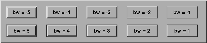
It is possible to alter the appearance of an object by changing the
border width attribute
| | void fl_set_object_bw(FL_OBJECT *obj, int bw);
|
To find out about the current setting for the border width of an
object call
| | int fl_get_object_bw(FL_OBJECT *obj);
|
Border width controls the "height" of an object, e.g., a button having
a border width of 3 pixels appears more pronounced than one having a
border width of 2. The Forms Library's default is
FL_BOUND_WIDTH (1) pixels (before version 1.0.91 the default
was 3). Note that the border width can be negative. Negative border
width does not make a down box, rather, it makes the object having an
upbox appear less pronounced and "softer". See program
`borderwidth.c' for the effect of border width on different
objects. All applications developed using XForms accept a command line
option `-bw', followed by an integer number, the user can use to
select the preferred border width. It is recommended that you document
this flag in your application documentation. If you prefer a certain
border width, use fl_set_defaults() or
fl_set_border_width() before fl_initialize()
to set the border width instead of hard-coding it on a per form or per
object basis so the user has the option to change it at run time via
the `-bw' flag.
There also exists a call that changes the object border width for the
entire application
| | void fl_set_border_width(int border_width);
|
3.11.3 Label Attributes and Fonts
There are also a number of routines to change the appearance of the
label. The first one is
| | void fl_set_object_lcolor(FL_OBJECT *obj, FL_COLOR lcol);
|
It sets the color of the label. The default is black (FL_BLACK).
The font size of the label can be changed using the routine
| | void fl_set_object_lsize(FL_OBJECT *obj, int lsize);
|
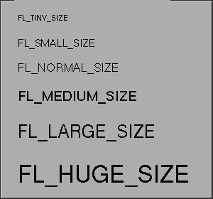
where lsize gives the size in points. Depending on the server and
fonts installed, arbitrary sizes may or may not be possible. Fig 3.5
shows the font sizes that are standard with MIT/XConsortium
distribution. So use of these values is encouraged. In any case, if a
requested size can not be honored, substitution will be made. The
default size for XForms is 10pt.
|
|
FL_TINY_SIZE | 8pt
|
FL_SMALL_SIZE | 10pt
|
FL_NORMAL_SIZE | 12pt
|
FL_MEDIUM_SIZE | 14pt
|
FL_LARGE_SIZE | 18pt
|
FL_HUGE_SIZE | 24pt |
Labels can be drawn in many different font styles. The style of the
label can be controlled with the routine
| | void fl_set_object_lstyle(FL_OBJECT *obj, int lstyle);
|
The default font for the Forms Library is Helvetica at 10pt.
Additional styles are available:
|
|
FL_NORMAL_STYLE | Normal text
|
FL_BOLD_STYLE | Boldface text
|
FL_ITALIC_STYLE | Guess what
|
FL_BOLDITALIC_STYLE | BoldItalic
|
FL_FIXED_STYLE | Fixed width (good for tables)
|
FL_FIXEDBOLD_STYLE |
|
FL_FIXEDITALIC_STYLE |
|
FL_FIXEDBOLDITALIC_STYLE |
|
FL_TIMES_STYLE | Times-Roman like font
|
FL_TIMESBOLD_STYLE FL |
|
FL_TIMESITALIC_STYLE |
|
FL_TIMESBOLDITALIC_STYLE |
|
FL_SHADOW_STYLE | Text casting a shadow
|
FL_ENGRAVED_STYLE | Text engraved into the form
|
FL_EMBOSSED_STYLE | Text standing out |
The last three styles are special in that they are modifiers, i.e.,
they do not cause font changes themselves, they only modify the
appearance of the font already active. E.g., to get a bold engraved
text, set lstyle to FL_BOLD_STYLE|FL_ENGRAVED_STYLE.
Other styles correspond to the first 12 fonts. The package, however, can
handle up to 48 different fonts. The first 16 (numbers 0-15) have been
pre-defined. The following table gives their names:
| | 0 helvetica-medium-r
1 helvetica-bold-r
2 helvetica-medium-o
3 helvetica-bold-o
4 courier-medium-r
5 courier-bold-r
6 courier-medium-o
7 courier-bold-o
8 times-medium-r
9 times-bold-r
10 times-medium-o
11 times-bold-o
12 charter-medium-r
13 charter-bold-r
14 charter-medium-i
15 Symbol
|
The other 32 fonts (numbers 16-47) can be filled in by the application
program. Actually, the application program can also change the first 16
fonts if required (e.g., to force a particular resolution). To change a
font for the the entire application, use one of the following routines:
| | int fl_set_font_name(int index, const char *name);
int fl_set_font_name(int index, const char *fmt, ...);
|
The first form accepts just a simple string for the font name while
the second assembles the name from a format string as it's used with
printf() etc. and the following arguments. The first argument,
index, is the number of the font (between 0 and
FL_MAXFONTS-1) and the font name should be a valid font name
(with the exception of the size field). If you are defining a
completely different font family starting at index k, it's a
good idea to define k + FL_BOLD_STYLE to be the corresponding
bold font in the family , and k + FL_ITALIC_STYLE the
corresponding italic font in the family (so object like browser can
obtain correct style when switching font styles):
| | #define Pretty 30
#define PrettyBold (Pretty + FL_BOLD_STYLE)
#define PrettyItalic (Pretty + FL_ITALIC_STYLE)
fl_set_font_name(Pretty, fontname);
fl_set_font_name(PrettyBold, boldfontname);
fl_set_font_name(PrettyItalic, italicfontname);
...
fl_set_object_lstyle(obj, PrettyBold);
|
The function returns a negative value if the requested font is invalid
or otherwise can't be loaded. Note however, if this routine is called
before fl_initialize(), it will return 0, but may fail later if
the font name is not valid. To change the default font
(helvetica-medium), a program should change font FL_NORMAL_STYLE.
If a font name in XLFD is given, a question mark
(?) in the point size position informs
the Forms Library that variable size will be requested later. It is
preferable that the complete XLFD name (i.e., with 14 dashes and
possibly wildcards) be given because a complete name has the advantage
that the font may be re-scalable if scalable fonts are available. This
means that although both
| | "-*-helvetica-medium-r-*-*-*-?-*-*-*-*-*-*"
"-*-helvetica-medium-r-*-*-*-?-*-*"
|
are valid font names, the first form may be re-scalable while the the
second is not. To obtain the actual built-in font names, use the
following function
| | int fl_enumerate_fonts(void (*cb)(const char *f), int shortform);
|
where cb is a callback function that gets called once for every
built-in font name. The font name is passed to the callback function as
the string pointer parameter while shortform selects if a short
form of the name should be used.
XForms only specifies the absolutely needed parts of the font names,
and assumes the font path is set so that the server always chooses the
most optimal fonts for the system. If this is not true, you can use
fl_set_font_name() or fl_set_font_name_f()
to select the exact font you want. In general, this is not recommended
if your application is to be run/displayed on different servers.
See `fonts.c' for a demonstration of all the built-in font styles
available.
You can change the alignment of the label with respect to the bounding
box of the object. For this you should use the routine
| | void fl_set_object_lalign(FL_OBJECT *obj, int align);
|
with the following values for the align argument:
|
|
FL_ALIGN_LEFT | To the left of the box.
|
FL_ALIGN_RIGHT | To the right of the box.
|
FL_ALIGN_TOP | To the top of the box.
|
FL_ALIGN_BOTTOM | To the bottom of the box.
|
FL_ALIGN_CENTER | In the middle of the box.
|
FL_ALIGN_RIGHT_BOTTOM | To the right and bottom of the box.
|
FL_ALIGN_LEFT_BOTTOM | To the left and bottom of the box.
|
FL_ALIGN_RIGHT_TOP | To the right and top of the box.
|
FL_ALIGN_LEFT_TOP | To the left and top of the box. |
Alignment requests with the abpve constants place the text outside the
box (except for FL_ALIGN_CENTER). To get a value that can
be used to align the label within the object the function
| | int fl_to_inside_lalign(int align);
|
can be used, which returns the necessary value for the corresponding
inside alignment. Except for the case of FL_ALIGN_CENTER
(which is always inside the object) the result is the original value,
logically or'ed with the constant
.
There's also a function for the reverse conversion, i.e., from a
calue for inside to outside alignment
| | int fl_to_outside_lalign(int align);
|
Using this functions is a bit simpler than combining the value with
the FL_ALIGN_INSIDE constant, especially when it comes
to FL_ALIGN_CENTER (which doesn't has the this bit set,
even though labels with this alignment will always be shown within
the object.
Both functions return -1 if an invalid value for the alignment
is passed to them.
There exist also three functions to test for the inside or outside
alignment:
| | int fl_is_inside_lalign(int align);
int fl_is_outside_lalign(int align);
int fl_is_center_lalign(int align);
|
Note that these functions return 0 also in the case that the
alignment value passed to them is invalid.
Not all objects accept all kinds of label alignment. For example for
sliders, inputs etc. it doesn't make sense to have the label within
the object und in these cases a request for an inside label is ignored
(or, more precisely, converted to the corresponding request for an
outside label or, on a request with FL_ALIGN_CENTER, the
reversion to the default label position). On the other hand, some
objects like the text object (where the text to be shown is the
label's text) accept only inside alignment and a request for an
outside alignment will automatically replaced by the corresponding
inside alignment.
See also the demo program `lalign.c' for an example of the
positioning of labels using the above constants.
Finally, the routines
| | void fl_set_object_label(FL_OBJECT *obj, const char *label);
void fl_set_object_label_f(FL_OBJECT *obj, const char *fmt, ...);
|
change the label of a given object. Whilw the first function expects a
simple string for the label. the second one accepts a format string
with the same format specifiers as printf() etc., followed by
as many additional arguments as there are format specifiers. An
internal copy of the label for the object is made. As mentioned
earlier, newline (\n) can be embedded in the label to generate
multiple lines. By embedding <Ctrl>H (\010) in the
label, the entire label or one of the characters in the label can be
underlined. The function
| | const char * fl_get_object_label(FL_OBJECT *obj);
|
returns the label string.
3.11.4 Tool Tips
As will be seen later, an object can be decorated by icons instead of
labels. For this kind of object, it is helpful to show a text string
that explains the function the object controls under appropriate
conditions. Forms Library elected to show the message after the mouse
enters the object for about 600 milli-seconds. The text is removed when
the mouse leaves the object or when the mouse is pressed.
To set the text, use the following routines
| | void fl_set_object_helper(FL_OBJECT *obj, const char *helpmsg);
void fl_set_object_helper_f(FL_OBJECT *obj, const char *fmt, ...);
|
where helpmsg is a text string (with possible embedded newlines
in it) that will be shown when the mouse enters the object, after
about a 600 milli-second delay. The second form of the function
accepts instead a format string like printf() etc., followed by
the appropriate number of arguments. In both cases an internal copy of
the string is made.
The boxtype, color and font for the message display can be customized
further using the following routines
| | void fl_set_tooltip_boxtype(int boxtype);
void fl_set_tooltip_color(FL_COLOR textcolor, FL_COLOR background);
void fl_set_tooltip_font(int style, int size);
void fl_set_tooltip_lalign(int align);
|
where boxtype is the backface of the form that displays the text.
The default is FL_BORDER_BOX. textcolor and
background specify the colors of the text string and the
backface. The defaults for these are FL_BLACK and
FL_YELLOW respectively. The style and size
parameters are the font style and size of the text. align is the
alignment of the text string with respective to the box. The default is
FL_ALIGN_LEFT | FL_ALIGN_INSIDE .
3.11.5 Redrawing Objects
A word of caution is required. It is possible to change the attributes
of an object at any time. But when the form is already displayed on the
screen some care has to be taken. Whenever attributes change the
system redraws the object. This is fine when drawing the object erases
the old one but this is not always the case. For example, when placing
labels outside the box (not using FL_ALIGN_CENTER) they are not
correctly erased. It is always possible to force the system to redraw an
object using
| | void fl_redraw_object(FL_OBJECT *obj);
|
When the object is a group it redraws the complete group. To redraw an
entire form, use
| | void fl_redraw_form(FL_FORM *form);
|
Use of these routines is normally not necessary and should be kept to an
absolute minimum.
3.11.6 Changing Many Attributes
Whenever you change an attribute of an object in a visible form the
object is redrawn immediately to make the change visible. This can be
undesirable when you change a number of attributes of the same object.
You only want the changed object to be drawn after the last change.
Drawing it after each change will give a flickering effect on the
screen. This gets even worse when you, for example, just want to hide
a few objects. After each object you hide the entire form is redrawn.
In addition to the flickering, it is also time consuming. Thus it is
more efficient to tell the library to temporarily not redraw the form
while changes are being made. This can be done by "freezing" the form.
While a form is being frozen it is not redrawn, all changes made are
instead buffered internally. Only when you unfreeze the form, all
changes made in the meantime are drawn at once. For freezing and
unfreezing two calls exist:
| | void fl_freeze_form(FL_FORM *form);
|
and
| | void fl_unfreeze_form(FL_FORM *form);
|
It is a good practice to place multiple changes to the contents of a
form always between calls to these two procedures. Further, it is better
to complete modifying the attributes of one object before starting work
on the next.
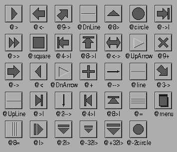
3.11.7 Symbols
Rather than using text as a label it is possible to place symbols like
an arrows etc. on objects. This is done in the following way:
When the label starts with the character @ instead of the text
a particular symbol is drawn(3). The rest of the label string indicates
the symbol. A number of pre-defined symbols are available:
-> | Normal arrow pointing to the right. |
<- | Normal arrow pointing to the left. |
> | Triangular arrow pointing to the right. |
< | Triangular arrow pointing to the left. |
>> | Double triangle pointing to the right. |
<< | Double triangle pointing to the left. |
<-> | Arrow pointing left and right. |
->| | A normal arrow with a bar at the end. |
>| | A triangular arrow with a bar at the end. |
--> | A thin arrow pointing to the right. |
= | Three embossed lines. |
arrow | Same as -->. |
returnarrow | <Return> key symbol. |
square | A square. |
circle | A circle. |
line | A horizontal line. |
plus | A plus sign (can be rotated to get a cross). |
UpLine | An embossed line. |
DnLine | An engraved line. |
UpArrow | An embossed arrow. |
DnArrow | An engraved arrow. |
See Fig. 3.6 for how some of them look.
It is possible to use the symbols in different orientations. When the
symbol name is preceded by a digit 1-9 it is rotated
like on the numerical keypad, i.e., 6 (and also 5)
result in no rotation, 9 a rotation of 45 degrees
counter-clockwise, 8 a rotation of 90 degrees, etc. Hence
the order is 6, 9, 8, 7, 4,
1, 2, 3. (Just think of the keypad as consisting
of arrow keys with 6 pointing in the default orientation, i.e., to
the right). So to get an arrow that is pointing to the left top use a
label @7->. To put the symbol in other orientations, put a 0
after the @, followed by the angle (counter-clockwise). E.g.,
to draw an arrow at an angle of 30 degrees you can use @030->.
The symbol will be scaled to fit in the bounding box. When the bounding
box is not square, scaling in the x- and y-directions will be different.
If keeping the aspect ratio is desired, put a sharp (#)
immediately after the . E.g., @#9->.
Two additional prefixes, + and -, followed by a single
digit, can be used to make small symbol size adjustment. A +
indicates an increase of the symbol size while a - a decrease.
The single digit following the prefix is the amount of increment (or
decrement) in pixels. For example, to draw a square that is 3
pixels smaller in size than the default size use @-3square.
If a single sequence of + or - and a single digit does
not suffice, it can repeated, the effect is cumulative. Of course,
this can also be combined with a rotation etc., so i.e.,
@-9-3030-> (the order in which the different sequences are
used doesn't matter) will result in an arrow drawn 12 pixels
smaller than normal and rotated by 30 degrees counter-clockwise.
As already stated the "default" size of a symbol is (this at least
holds for the built-in ones) one where it fits autoatically into the
box it is to be drawn into, with a bit of room left around it. Thus
the size of the symbol should in most cases be fine without any
further fine-tuning. If you increase the size for whatever reasons
please consider that the symbol automatically gets clipped to the area
it is will be drawn into, i.e., increments that result in the symbol
becoming larger than the box it is to be drawn into should be avoided.
In addition to using symbols as object labels, symbols can also be drawn
directly using
| | int fl_draw_symbol(const char *symbolname, FL_Coord x, FL_Coord y,
FL_Coord w, FL_Coord h, FL_Color col);
|
(the function returns 1 on success and 0 on failure
when the symbol name isn't valid) or indirectly via
fl_drw_text(). Drawing is clipped automatically to the
area given by the arguments.
The application program can also add symbols to the system which it
can then use to display symbols on objects that are not provided by
the Forms Library. To add a symbol, use the call
| | int fl_add_symbol(const char *name, void (*drawit)(),int sc);
|
name is the name under which the symbol should be known, which
may not have a @, a # or a digit at the start (or
+ or -, directly followed by a digit). drawit()
is the routine to be called for drawing the symbol. sc is
reserved and currently has no meaning. Best set it to 0.
The routine drawit() should have the form
| | void drawit(FL_Coord x, FL_Coord y, FL_Coord w, FL_Coord h,
int angle, FL_COLOR col);
|
col is the color in which to draw the symbol. This is the label
color that can be provided and changed by the application program. The
routine should draw the symbol centered inside the box by x,
y, w, h and rotated from its natural position by
angle degrees. The draw function can call all types of drawing
routines, including fl_draw_symbol(). Before it is called
clipping is set to the area given by the first four arguments.
If the new symbol name is the same as that of a built-in or of one
previously defined, the new definition overrides the built-in or
previously defined one.
The function returns 1 on success and 0 on failure
(due to invalid arguments).
The symbol handling routines really should be viewed as a means of
associating an arbitrary piece of text (the label) with arbitrary
graphics, application of which can be quite pleasant given the right
tasks.
A symbol (built-in or previously defined) can also be deleted
using
| | int fl_delete_symbol(const char *name);
|
On success 1 is returned, otherwise 0.
3.12 Adding and Removing Objects
In some situations you might want to add objects to an already
existing form (i.e., a form for which fl_end_form()
| | FL_FORM *fl_addto_form(FL_FORM *form);
|
After this call you can again add objects to the form with the usual
functions for adding objects (like fl_add_button() etc.).
When done with adding objects to the form again call
fl_end_form(). It is possible to add objects to forms
that are being displayed, but this is not always a good idea because
not everything behaves well (e.g., strange things might happen when a
group is started but not yet finished).
To remove an object from a form simply use
| | void fl_delete_object(FL_OBJECT *obj);
|
It removes the object from the form it currently belongs to and also
from a group it may belong to. The argument can also be the
pseudo-object starting a group (i.e., the return value of
fl_bgn_group()) in which case the whole group of objects
will be removed from the form.
Contrary to what the name of the function may hint at the object
itself isn't deleted but it remains available (except if it's an
object that marks the start or end of a group) and thus it can be
added again to the same or another form (without having to call
fl_addto_form() first and fl_end_form()
afterwards) using the function
| | void fl_add_object(FL_FORM *form, FL_OBJECT *obj);
|
Normally, this function should only be used within object classes to
add a newly created object to the form currently under construction.
It can not be used for pseude-objects representing the start or end of
a group.
3.13 Freeing Objects
If the application program does not need an object anymore it can
completely delete it, freeing all memory used for it, using a call of
| | void fl_free_object(FL_OBJECT *obj);
|
After this the object is truely destroyed and can no longer be used.
If you hadn't removed the object from the form it did belong to using
fl_delete_object() before this will be done
automatically.
To free the memory used by an entire form use a call of
| | void fl_free_form(FL_FORM *form);
|
This will delete and free all the objects of the form and the form
itself. A freed form can not be referenced anymore.
This document was generated by Jens Thoms Toerring on January 5, 2014 using texi2html 1.82.